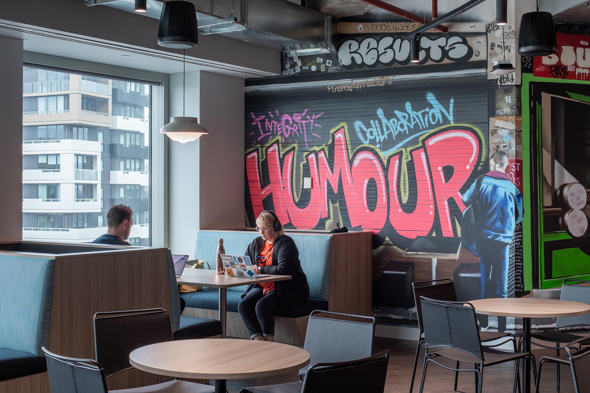
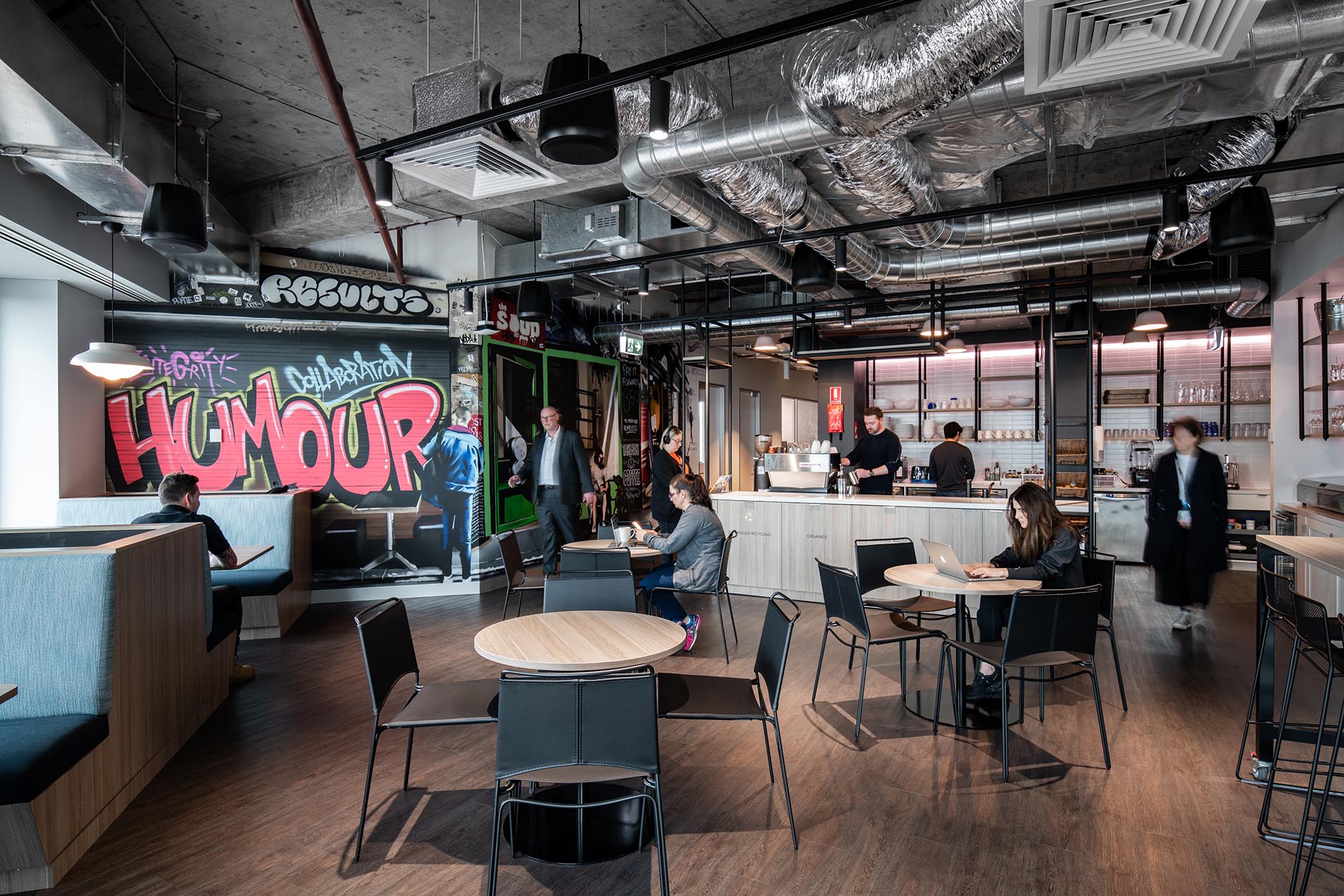
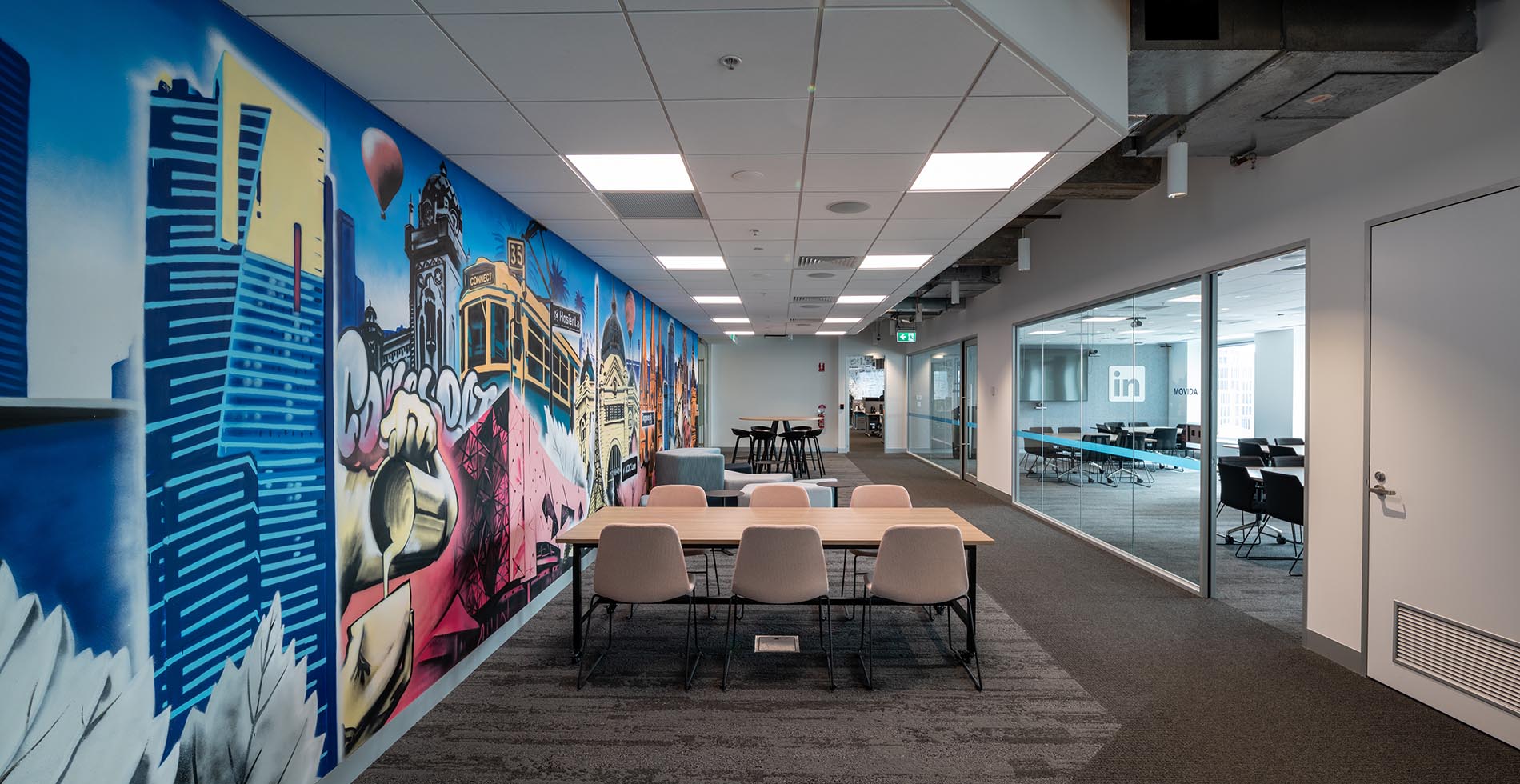
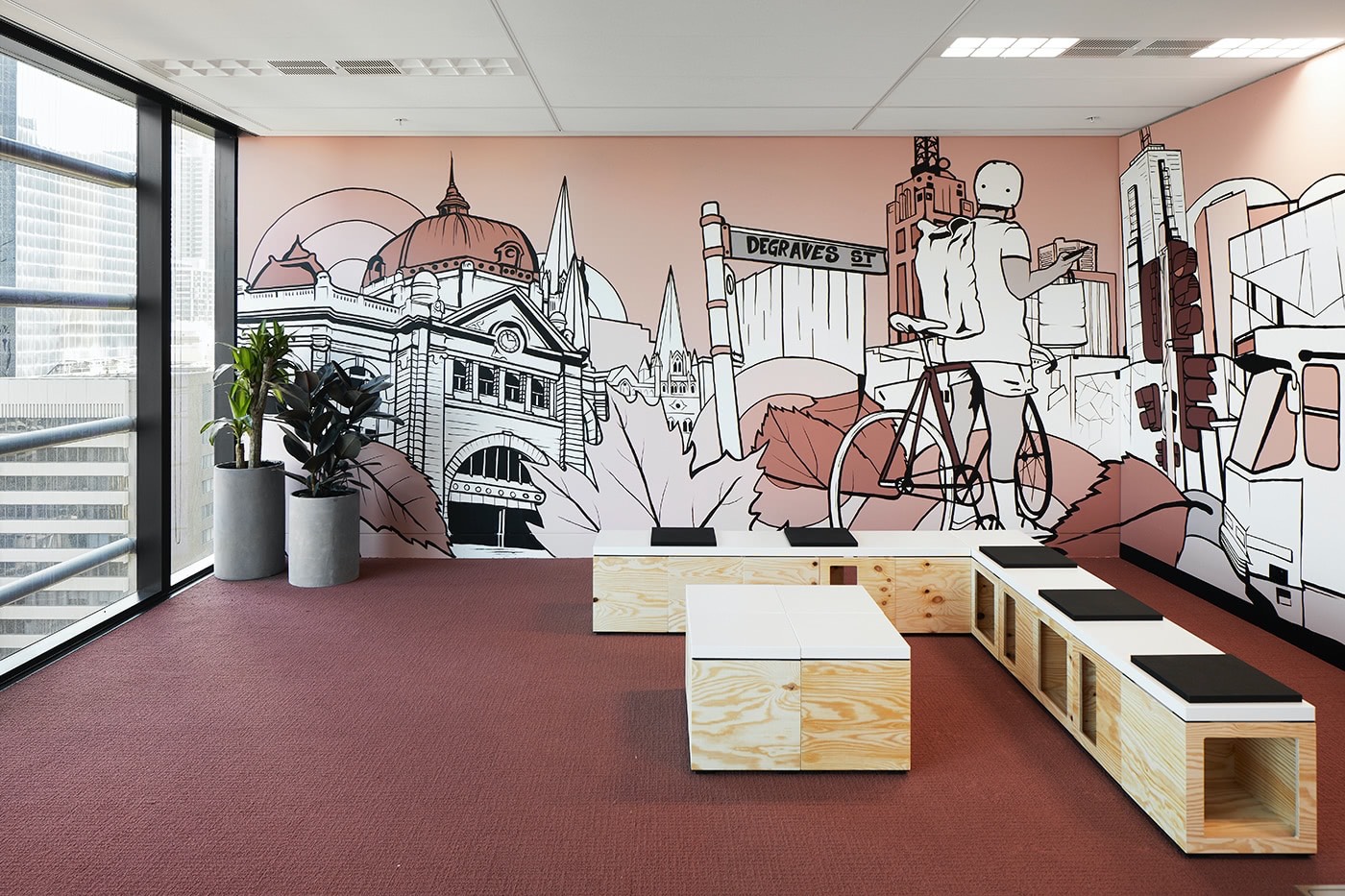
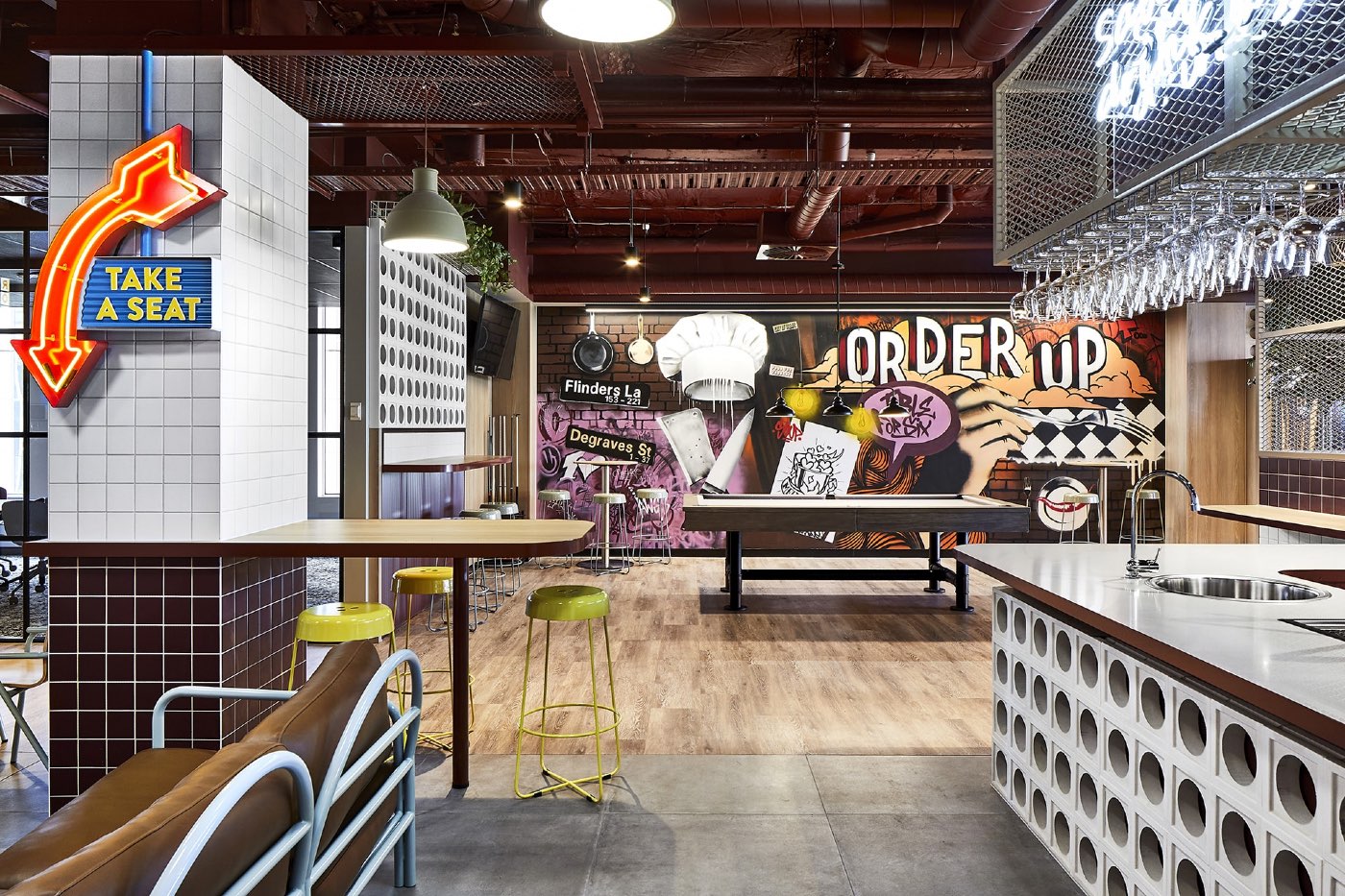
Being a global company, it's no surprise that the main feature of the artwork for this office space was site-specific - a celebration of Melbourne, its landmarks and laneways. The spaces where artwork was required called for completely different design styles - one photorealistic and one a mix of styles incorporating colours supplied by the interior design team with limitations set within the finishes schedule for the fit out.
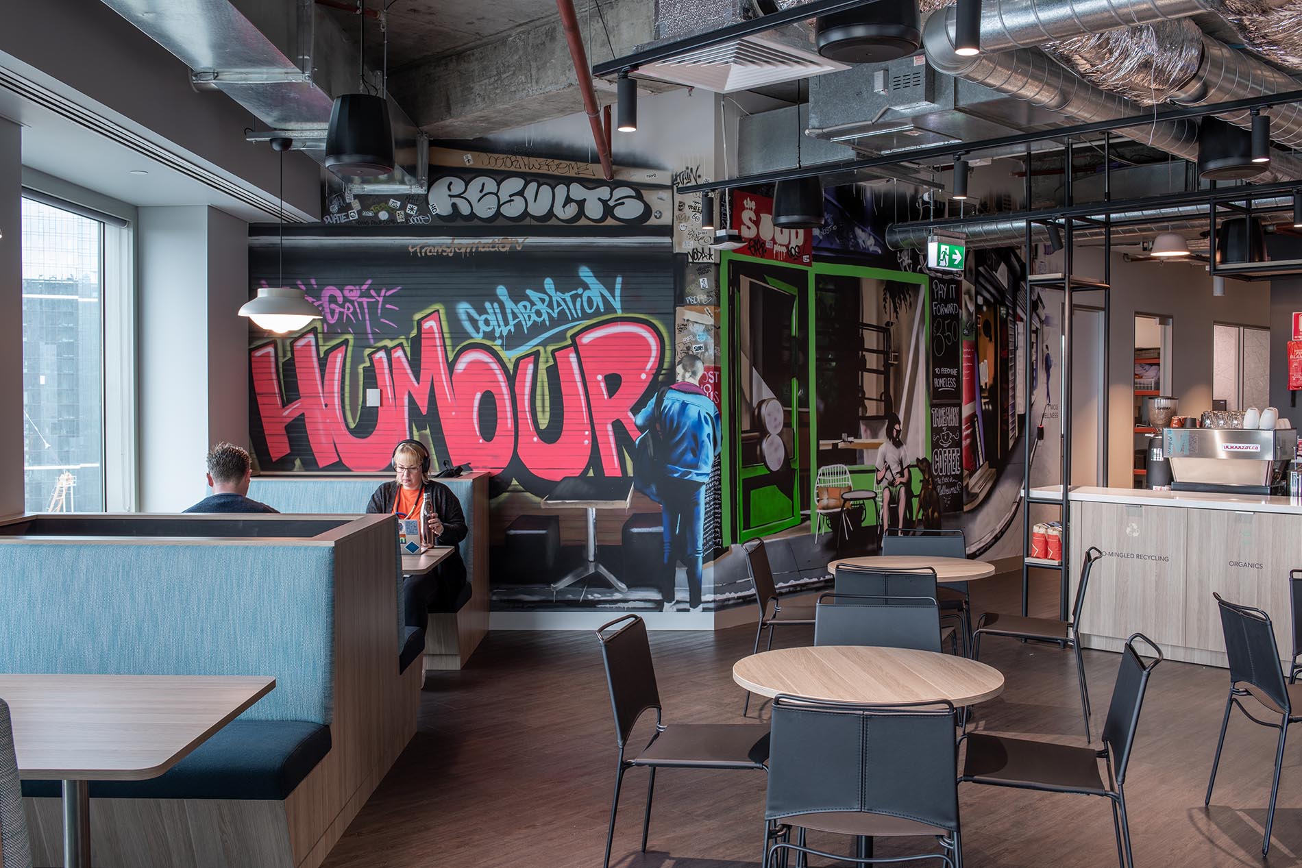
Melbourne Laneway scene created by Danny Awes
To create the photorealistic street image in the staff lunch space, Dan hit the laneways of Melbourne armed with his camera. He took a series of images and then pulled out key components of those images to digitally create the photorealistic composite image he painted.
90 Degrees were an absolute pleasure to work with. The team were responsive, adaptable and took the time to really understand the brief and styles we were after. Working within a tight time frame, the regular touchpoints in their design process resulted in a final graphic that tied in with our overall design and that the end-client absolutely loved.
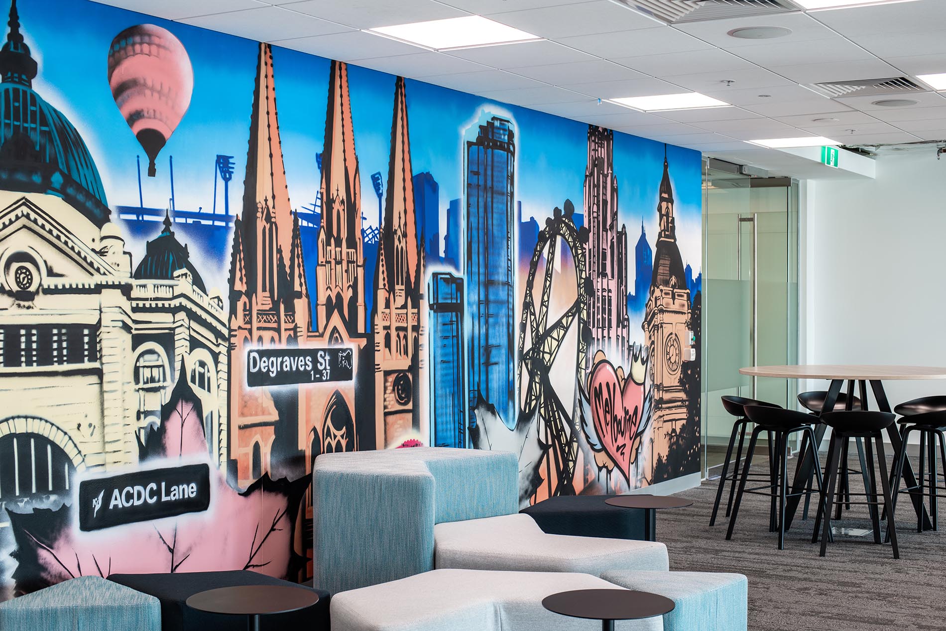
Melbourne Landmarks mural artwork designed and painted by Danny Awes
As is our preference for big office fit-outs we were some of the last people on site for this project. We like to get in after all the dirty work has been done to avoid any plaster dust or particles from floor polishing interfering with our materials and their ability to sit well on surfaces. One of the requirements for this project site was the exclusive use of low-tox materials so these murals were completed using 100% water-based aerosols.
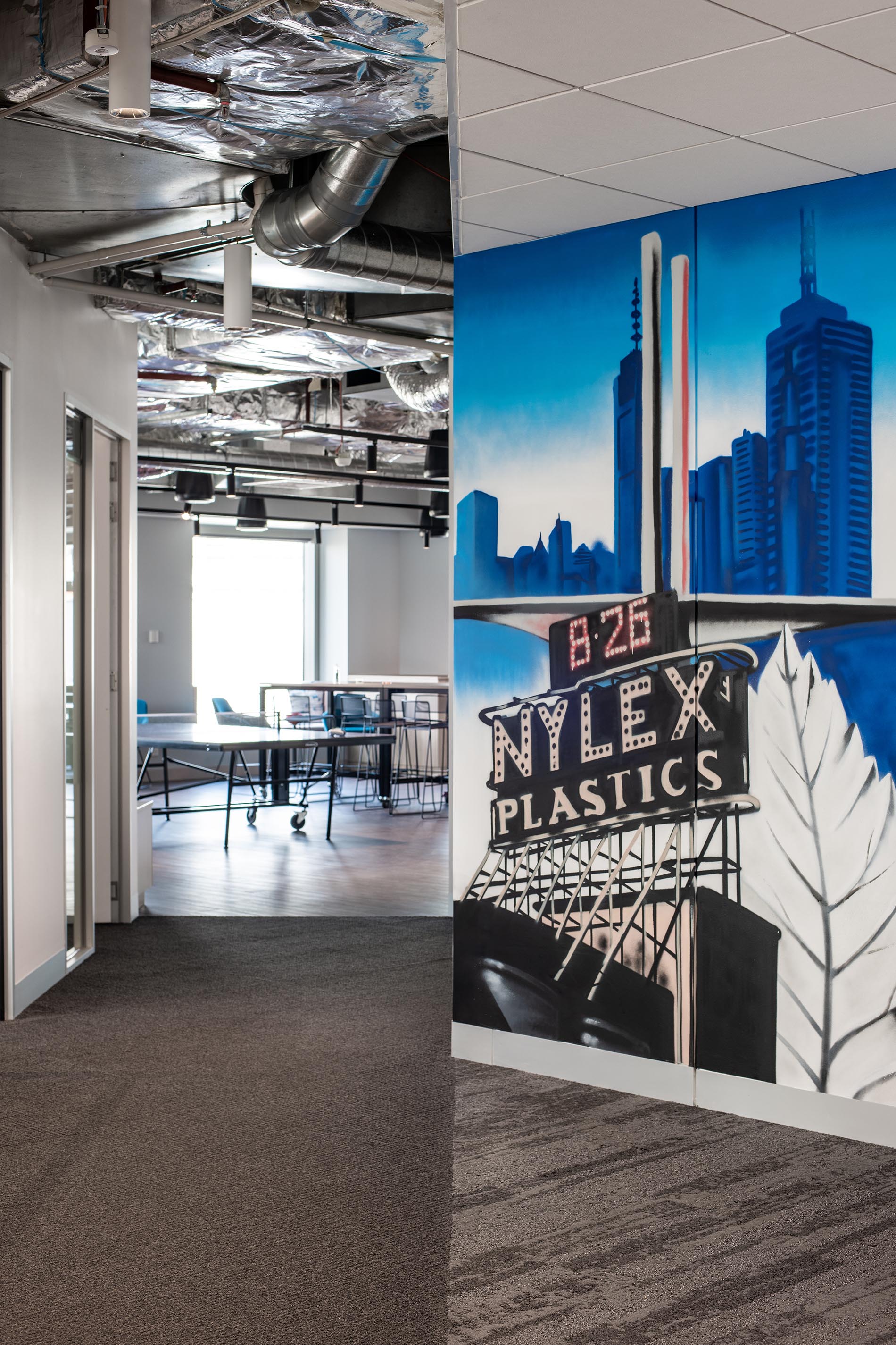

36 Cans of spray paint

52 Colors

80 Hours to paint
More Workplace Art —

Our Services
- MuralsGraffiti and street art murals for anywhere - hospitality, office, residential...01
- Brand ActivationsBranded live graffiti for product launches & brand activations. 02
- EventsLive artwork production by graffiti and street artists for events.03
- Removable ArtStreet art and graffiti prints, canvases and wallpaper.04
- DesignLogos, rebranding, graffiti and street art graphic design for print and digital.05
- WorkshopsLearn to paint with a spray can via a graffiti workshop experience.06
- Content CreationFilm a mural being painted and share the content on socials.07
- MaintenanceCare and upkeep of outdoor and indoor graffiti and street art murals.08
Read more about our services. Learn about our process.
