How to write graffiti - a beginners guide - Volume 1
A step by step guide on how to draw graffiti for beginners - Volume 1
This article will introduce you to the basics of creating a graffiti piece. We will discuss techniques of graffiti design and tricks you can use to make your artwork stand out. We will break down the anatomy of a piece and discuss some of the different letter styles you can use.
We will also look at handstyles (tags), reading a tag, and creating your own.
Want to be a street artist? Download Dan's Guide:
As a self-taught street artist, I've learnt so much over the years.
I've put together my top tips, with detailed info I wish I'd known.
Find out how to get started as a street artist

Designing Basic Handstyle Letters
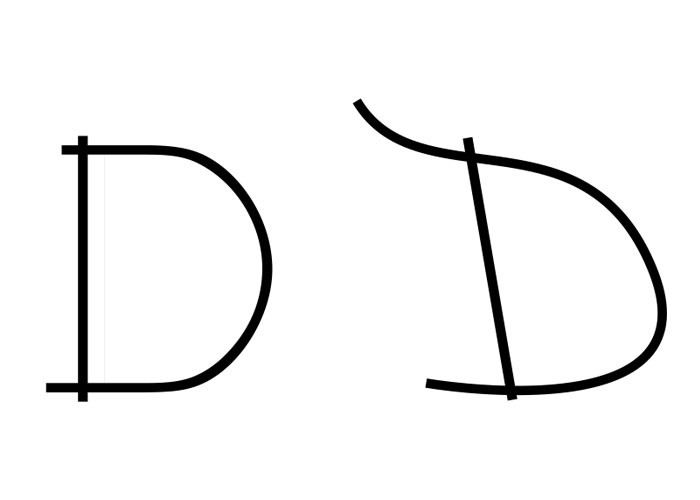
Let's start by drawing the letters of your tag in capitals. If you haven't got a tag, then use your own name.
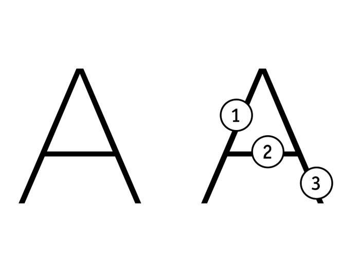
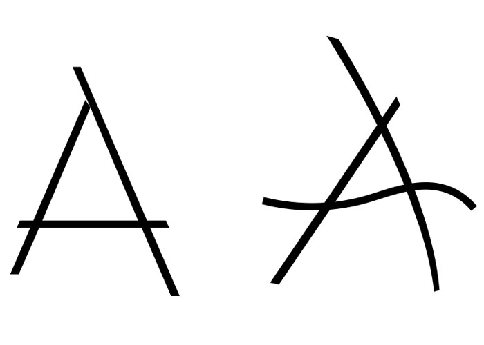
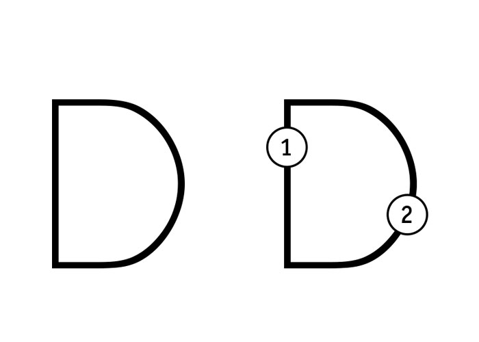
Take note of each line that makes up the letter. For example, the letter A consists of three straight lines. Each of these lines can be styled: bent, lengthened or shortened. Experiment with the lines of the letter to discover what you can tweak to make the letter appear more attractive and interesting.
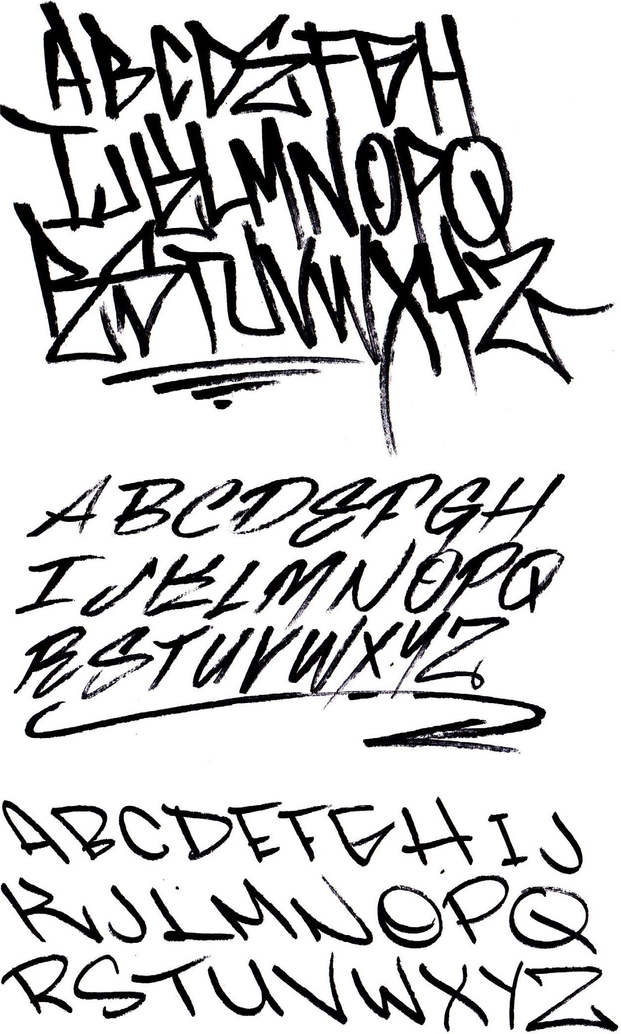
Handstyle - Graffiti Tag Alphabet Ideas
Here are some basic alphabets we created that you can use as a guide when creating your own tag.
After playing around, start experimenting with your own letter styles and create your own alphabet.
Having your own style is part of making your tag. Having your own style will allow you to chuck your buddies name up next to your piece while still retaining a consistent style.
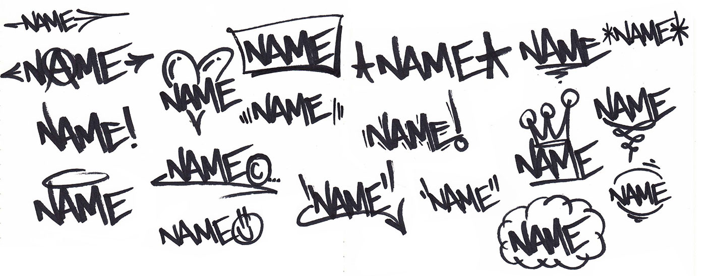
Handstyle - Graffiti Tag Symbols
It is common for writers to add symbols to their tags to decorate and add emphasis. Symbols can be numbers, arrows or basically anything that helps make the tag recognisable and completly unique to the writer. An excellent way to think of symbols is they are just like an icon you find to support a company brand logo.
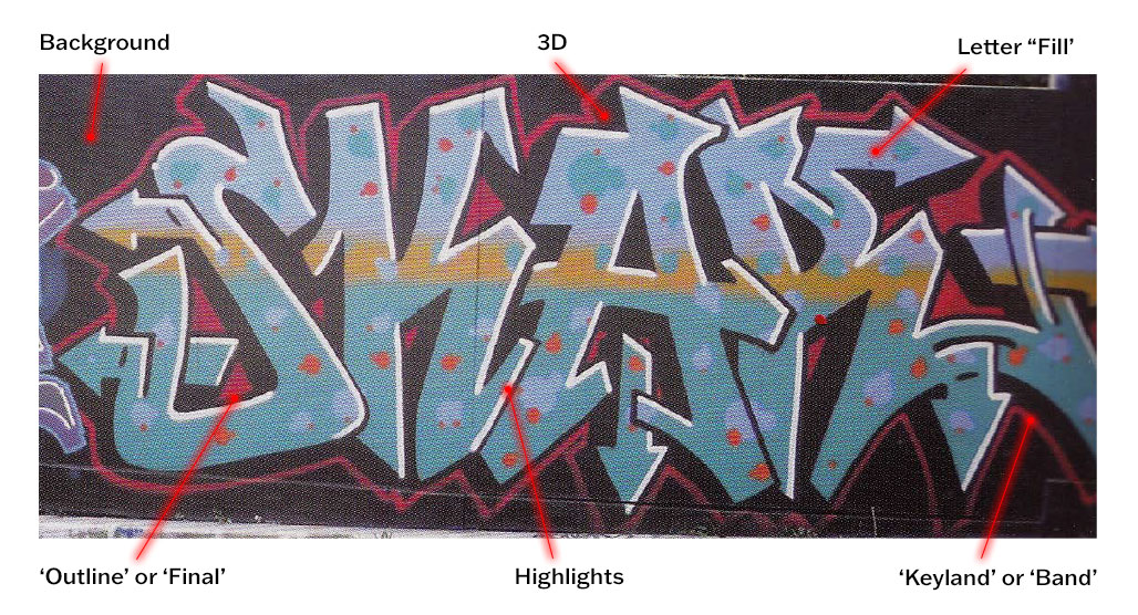
The Anatomy Of A Graffiti Piece
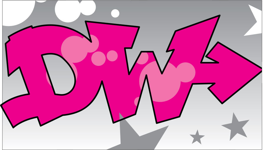
A tag is similar to calligraphy: a single slash of a brush or pen. A graffiti piece is different. Pieces have thick letters, outlined with colourful interiors referred to as the ''fill''. The letters of a piece are often blocked out and made to look three dimensional, and the entire piece sits over a background design or flat colour.
Types of Graffiti Pieces
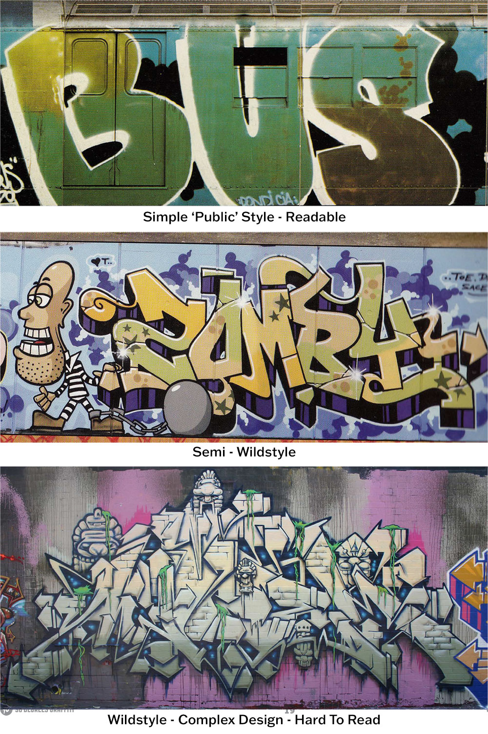
Graffiti piece styles have evolved over the years. In the earliest days, pieces were very simple and easy to read. Over time writers have become more creative and developed totally new styles. No doubt graffiti will continue to evolve, and new styles will be made in the future. The three most common styles are:
Simple ''Public'' Style
The simplest and earliest form of graffiti piece that is easy to read.
Semi Wildstyle
An elaboration on simple with more complex letterforms, symbols, swooshes and arrows that make it more difficult for a novice to read.
Wildstyle
Wildstyle is a complex design with obscure letter styles that blend into other letters and design elements. The complexity makes wildstyle hard to read. Even for experienced writers, it can take time for the letters to reveal themself.
How To Design Your First Graffiti Piece
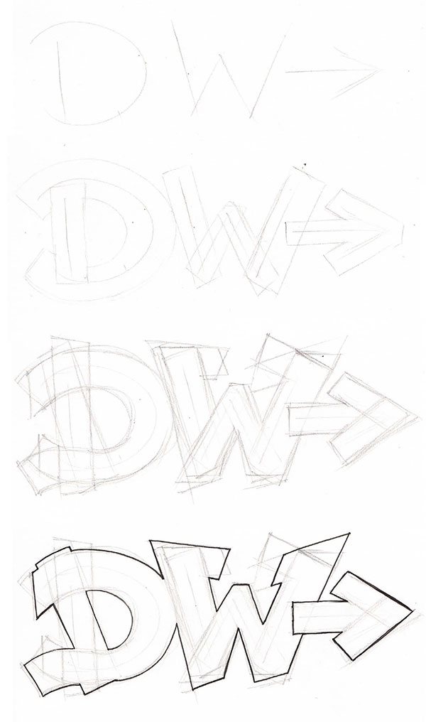
Designing a piece is similar to designing a tag. You study the construction of the letters and what lines make them. The difference with a piece is that you will thicken the letters up.
Similarly to what was mentioned when creating a tag, the lines that make the letter can be extended, joined to other lines, and even change direction.
The below illustrations show how you create what is called the outline. An outline is required before painting your piece.
- Create the basic letters as lines
- Thicken the lines into enclosed shapes
- Refine the letters by changing the direction, thickness, extending, tilting, joining, segmenting and skewing the shapes.
- Finally, ink over the grey lead sketch, choosing only the best lines and then rub out the grey lead, so your piece is nice and clear.
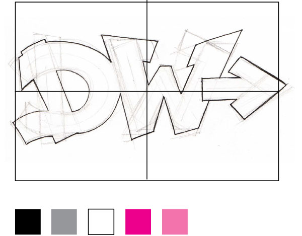
Preparing to paint your graffiti piece
When painting on boards or canvas, it's hard to know how big to do your letters. By drawing a grid and the shape of the canvas/board over your outline, you will know where things need to sit on the board. Draw your grid lines on your board/canvas in chalk or light spray paint.
When it comes time to choose a colour scheme for your piece, keep it simple. Too many colours can make things look messy and overly complicated. Some of the best pieces are simple and only use two or three colours.
Black/white and greys are a great place to start because you can add any colour to black/white/gray, and it will work. Choose a tint colour and then a similar shade (darker or lighter) of that same colour.
Painting your piece- Step by Step Best Practice
Use the below guide to lay down the artwork of your first peice. This is the first volume of learning how to paint graffiti. Look out for our next volume, in which we will explore some more advanced graffiti techniques and sign up to our mailing list for updates because we will be launching an online course this year!


Get your free guide to getting started as a graffiti or street artist!


Free consultation
Let's chat about how to make your space better in a free 30-minute online consultation. Inspiration plus answers.
Book a free consultation
Get in touch
Ready for a quote? Want to book a corporate workshop? Just want to say hi? We'd love to hear from you.
Get in touch